Aims for week 5
Your aims for this week's work should be to -
- Add content to your Learning Journal and bring it up to date. Write posts using a
range of the elements that you have learned over the past 5 weeks and experiment with CSS to style them.
- Make a start on the second part of the assignment - the Tutorial page. Just as with
the Learning Journal the workflow should be -
- Create the document
tutorial.html, with HTML5 doctype and link to
the Learning Journal page with navigation elements <nav> and <ul> <li> (you should have already done this, in
Lab tutorial 1)
- Write the content; structure with HTML markup (using HTML5 page section elements and divs
where semantically appropriate)
- Add this line in the
<head> of the web document -
<meta name="viewport" content="width=device-width, initial-scale=1">
- Attach the style sheets to the document head -
stylesheet.css and normalize.css. Your own style sheet should be attached after normalize.css - see lab tutorial 4, Step 1 and Step 2 if you cannot remember how to do this. There is no need to make a new stylesheet for each web page.
CSS: styling text
The purpose of this tutorial is to show how to use CSS to style text to enhance
the appearance and readability of your web pages.
Text is probably the most important content in a web page - for both users and search engines, which index text content in order to make websites findable. It is therefore important to pay some
attention to both writing and styling text content. In the following steps you will learn how to -
Whenever you make any changes to your web pages remember to save them and preview them
in a browser to see how they will display.
Step 1: Specify font-family with a fallback
A font is a set of text characters in a specific style - e.g. Verdana, Georgia, Consolas. It's important to specify the right font for the job - bold and decorative for elements
such as headings; unobtrusive, legible and accessible fonts for paragraph text. In the past, web
designers were limited by the fonts that were installed on a user's computer. That is why it is good practice always to specify a font-family,
specifying a series of common fonts to fall back on if the user does not have the preferred
font on their computer, for example -
body {
 font-family: Georgia, "Times New Roman", Times, Serif;
 font-size: 100%;
 color: #333;
 line-height: 1.5;
}
Note the following -
- The first font in the list is the preferred one, followed by the fall-back(s) and, finally, the
font type - Serif, Sans-Serif or Monospace
- Each font in the list must be separated by a comma
- Fonts with names that have more than one word must be in quotation marks
- Declaring a default
font-size of 100% (as a percentage of 16 px, the default
font-size in browser style sheets) for the <body> element means that the document base font-size is also 16 px. If you are using rems as the font-size unit of measurement then 1rem = 16 px. This is covered in the Week 5 lecture on CSS measurement.
Step 2: Web fonts - Google Fonts
There is now an alternative to restricting your choice of font to those that every user
will have on their computer. Online font libraries make it possible to link fonts to the document:
a font from an online library will be loaded when the web page is viewed in the browser.
The easiest way of doing this is to use Google's free font library -
https://www.google.com/fonts/. Full instructions about
how to choose a font and link it in the head of the document are provided in the Google guide - Get Started with the Google Fonts API.
Using a web font is easy: just add a link in the head of your web pages to the web font(s) you want to use, then use the font in a CSS style. The code to embed the font in the <head> of the web page is provided when a Google font is selected.
For example, to use the Google web font Strait add the
following line to the HTML document -
<link href="http://fonts.googleapis.com/css?family=Strait" rel="stylesheet">
- and the following declaration to the h1 and h3 selector rules in the CSS stylesheet -
h1	{
 font-family: 'Strait', sans-serif;
 color: #F30;
 font-size: 3em;
 line-height: 2em;
}
h3	{
 font-family: 'Strait', sans-serif;
 font-size: 1.5em;
 line-height: 1.7em;
}
While library fonts may be good for headings and other text on your
page where a decorative effect is desirable, plain and simple fonts are the most legible - don't use novelty web fonts for all the text on your page, just because you can!
Go to top of page
Step 3: Style paragraphs: line-height, margin, text-indent, dropcap, text-align
Making more space between lines of text enhances legibility and the appearance of the page.
Use the line-height property, for example -
p {
 font-size:1.25rem;
 line-height: 1.5; (1.5 of 20px/1.25rem = 30px/1.875rem)
}
To create space between blocks of text use the margin property, which in this
example is applied to the top and bottom margins of the paragraph -
p {
 font-size:1.25rem;
 line-height: 1.5;
 margin: 10px 0 10px 0;
}
It is not necessary to specify a unit of measurement when declaring the line-height property
of an element. Leaving it unit-less ensures that the line-height is consistent on all elements.
Despite the fact that two paragraphs both have upper and lower margins of 10px, the space
between paragraphs will be 10px, not 20px (10px + 10px). This is because the margins between
elements 'collapse' in order to stop the total margin space between the two
elements becoming too large.
If there are several paragraphs of text on a page it can improve legibility to indent the
first line of each paragraph, for example -
p {
 ...
 text-indent: 2em;
}
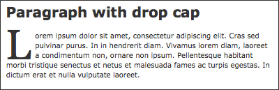
Drop caps are used in printed content, such as magazines and
newspapers, to style the opening paragraph of an article and they can also be used on the web
to give blog posts a print look, for example -
To create a drop cap add a class attribute to the paragraphs that you want to style this way -
<p class="dropcap">Lorem...
Add the following rule to the stylesheet using the pseudo-element :first-letter to
the .dropcap class selector -
p.dropcap:first-letter	{
  float: left;
  font-family: Georgia, "Times New Roman", Times, serif;
  color:#F00;
  font-size: 5em;
  line-height: 0.2;
  margin: 8px 5px 0 0;
}
Here's an example of a paragraph with a drop cap - look at the source code to see how it is styled.
The text-align property is used to align type in a block element, with these values - left,
right, center, justify - for example -
p {
 ...
 text-align: right;
 }
Justifying paragraphs on the web only looks acceptable if the columns are wide, and the value
should be used with care. Centering block elements is more effective with headings and can look
ragged and be difficult to read if applied to paragraphs.
Go to top of page
Step 4: Float an image and wrap text around it
The CSS float and clear properties are used to lay out images on the page so that the text content wraps around them. In the example Learning Journal there is an image and text
content marked up like this -
<a href="http://www.w3.org/html/logo/">
<img src="images/HTML5logo.png" alt="HTML5 logo"></a>

<p>Lorem ipsum ... The W3C has made an HTML5 logo that you can add to your web page.
The HTML5 logo is licensed under <a href="https://creativecommons.org/licenses/by/3.0/">
Creative Commons Attribution 3.0</a> and is free to use. Lorem ipsum ...</p>
Nest the <img> in a <div> element with the class attribute
'fltlt' (float left). Following this section of content the next element, a <p> paragraph, has been given the class attribute 'clear' to end the float. The image and text should now be marked up like this -
<div class="fltlt">
<a href="http://www.w3.org/html/logo/">
<img src="images/HTML5logo.png" alt="HTML5 logo"></a>
<div>

<p>Lorem ipsum ... The W3C has made an HTML5 logo that you can add to your web page.
The HTML5 logo is licensed under <a href="https://creativecommons.org/licenses/by/3.0/">
Creative Commons Attribution 3.0</a> and is free to use. Lorem ipsum ...</p>

<p class="clear"><a href="#top">Go to top</a></p>
The CSS rules, using the class selectors .fltlt and
.clear, are like this -
.fltlt {
 float: left;
 margin-right: 8px;
}
 .clear {
 clear: both;
}
If you want to float an image to the right of the text, add this rule to your stylesheet -
.fltrt {
 float: right;
 margin-left: 8px;
}
If you float an element everything that follows will also float until you clear the float using the clear property. This should be applied to the next element following the floated elements.
You can see how the floated image works in the
example Learning Journal. Make the browser window narrow to see how the text wraps around the image.
If you have not had time to complete the tutorial please carry on and finish it in your own time. If you have any questions email Jennie Harding.
Go to top of page
Step 5: Validate the HTML and CSS
Check the URL of your CSS file on the Brighton Domains web server: it will be something like -
http://YOURUSERNAME.brighton.domasins/FOLDERNAME/stylesheet.css
Go to the W3c CSS validation service and enter the name of the URL to check your code.
Don't forget: keep validating your html, as detailled in previous weeks: w3c validator.
If you have not had time to complete the tutorial please carry on and finish it in your own time. If you have any questions email Jennie Harding.
Go to top of page